# Overview
In the previous code, when you open preferences, there is a section
headed "Filters" with a section called "Tabs"
This is confusing.
# Changes
- Change the section title from "Filters" to "Per-timeline preferences."
- Change the current "Tabs" section to "Home timeline" since it is only
for home timelines
# Screenshots
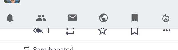
account preference screen | detail screen
:--: | :--:
|<image
src="https://github.com/tuskyapp/Tusky/assets/62137820/12694f24-b7e3-4ba3-90f5-53740e9c4269"
width="250" />|<image
src="https://github.com/tuskyapp/Tusky/assets/62137820/796e9ac1-76d6-43ef-a087-a1cd2d899ef8"
width="250" />
# Note
- Maybe string resources should have a new property? (for translation)
# Related link
Fixes#3536
---------
Co-authored-by: mcc <andi.m.mcclure@gmail.com>
This changes one word in the string `pref_failed_to_sync` in the file
`values/strings.xml`.

See my reasoning here #4133

"Failed to sync settings" changes to "Failed to sync preferences".
I [posted our new video player layout] on Mastodon for comments and
multiple people said the buttons were too close together. I agree. I
added some space (I eyeballed it, I made it bigger until it felt too big
and then I narrowed it), I think we have now increased the space from
10dp to 25dp. I added the space by wrapping the buttons in
LinearLayouts, because they are <include>s and could theoretically
insert more than one button.

Concerns: If the "next"/"prev" buttons ever become active, the space
will not be correctly applied to those. We can fix that if it ever comes
up (we don't display those buttons). If people think the buttons should
be placed even further apart we can do this by just increasing the
number in styles.xml.

This is what it looks like now. See previous look and comparison with
23.0 in #4071

<img width=400
src="https://files.mastodon.social/media_attachments/files/111/293/547/524/867/101/original/91b83e1717111444.png">
Fixes: #4063
Switching from an AlertDialog to only a DialogFragment.
I didn't get the AlertDialog to be sized correctly.
It also opens now directly with the right (full screen) size. When the
imageView fails to load (i.e. with an audio file) it will be hidden.
This changes the button layout somewhat.
One observation: The placeholder text "... visually impaired..." is not
quite right as a description for an audio file is not intended for the
visually impaired. But I couldn't think of a better text just yet.

Fixes#2512
Can add an arbitrary number of tabs.
Graphical behavior is unchanged for small numbers: the whole space if
filled with the tabs - they are enlarged if needed.
If there are more the mode switches to "scrollable".
This does not, however, look very differently (see screenshot with the
current tab scrolled out).
---------
Co-authored-by: Konrad Pozniak <connyduck@users.noreply.github.com>
This adds support for the new Mastodon 4.2 role badges. Admins can
define if a role should be visible in the interface and then we get it
delivered by the Api on the `Account` object like this:
```
"roles": [
        {
              "id": "4",
              "name": "TEST",
              "color": "#ffee00"
        }
  ]
```

- keeps compatibility with older Mastodon version and non Mastodon
servers
- Took me a while, but I figured out a way to use the color and have it
look ok on all backgrounds (Mastodon itself ignores the color and just
always uses its brand color)
- falls back to Tusky blue in case no color is configured
- I adjusted the "Follows you" and "Bot" badges so they match the new
badge style
- In case the "Follows you" and "Bot" badges are visible at the same
time, "Follows you" gets its own line and "Bot" goes into the same line
as the role badge.
- Will work even with a lot of role badges (right now users can only
have 1 role at once though)
- Will work even when the badges federate (right now they don't)

<img
src="https://github.com/tuskyapp/Tusky/assets/10157047/24cbe889-ae46-408e-bfa0-cf3fd3c24f74"
width="320" />
Previously the notification filter and clear actions were shown as
buttons in the UI, with a preference that determined whether they were
displayed.

Remove this preference, and display them as menu items.

- "Filter notifications" is shown as an icon, if possible
- "Clear notifications" is only ever shown as a menu item, to reduce the
chance the user inadvertently selects it

To ensure that the options menu appears correctly, remove the code that
creates a "fake" action bar, and adjust the layouts so that there are
three toolbars;

- mainToolbar -- displays the icons, and the current "location" (Home,
Notifications, etc)
- topNav -- displays the row of tabs at the top
- bottomNav -- displays the row of tabs at the bottom

Only one of them is set as the support action bar (depending on the
user's preferences). This provides the "show a logo" and "show the
options menu" functionality as standard, without needing to re-implement
as the previous code did.
Prevent users from accidentally deleting filters by prompting them to confirm.
Add an AlertDialog extension that converts AlertDialog callbacks to linear control flow.
Fixes#3736.
Previously, the thread indicator would start at the top of the avatar
for the status at the start of the thread, and end at the top of the
avatar for the status at the end of the thread.

If these avatars were partially transparent the thread indicator could
either (a) poke out of the top of the avatar at the start of the thread,
(b) not properly connect with the avatar at the end of the thread, or
(c) both.

Partially fix this by making the divider start/stop in the middle of the
avatar. This assumes that this area will typically have opaque content,
even if some of the rest of the avatar is transparent. This is not
always true, but it's still better than the current behaviour.
Make it easier for people to find information we need for a bug report,
and show it on AboutActivity.

New info is:

- Device manufacturer (e.g., "Google") and model (e.g., "Pixel 4a (5G)")
- Android version (e.g., "13")
- SDK version (e.g., "33")
- Active account (e.g., "@Tusky@mastodon.social")
- Server's version (e.g., "4.1.2+nightly-20230627")

All info is copyable to make it easy to include in a bug report. A
button to copy the information is also shown.
Fix a crash where workers, in some conditions, should show a notification. These are sent to a dedicated channel with no importance.
Convert NotificationWorker to a CoroutineWorker and remove its use of `runBlocking`.
Fixes#3754
Most lists in the app use (explicitly or implicitly) platform metrics for dimensions, text size, colour, and so on, possibly via styles.

A few don't, inadvertently using the user's setting for status text size

Fix these, and simplify code where possible.

- Use android attributes for padding and height, for consistent UX.

- Remove explicit usage of app:tabTextAppearance, rely on the style.

- Remove ListSelectionAdapter and item_picker_list.xml, and adjust TabPreferenceActivity to use an ArrayAdapter with simple_list_item_1.xml

- Simplify item_followed_hashtag.xml, consistent with item_list.xml.

Fixes https://github.com/tuskyapp/Tusky/issues/3131
Font scaling is applied in addition to any scaling set in Android system preferences. So if the user set the Android font size to largest (a 1.3x increase) and then sets the preference to 120%, the total change is 1.56x.

Create SliderPreference to adjust the preference.

- Use Slider, which supports float values and step sizes > 1
- Display the selected value in the preference's summary
- Provide buttons to increment / decrement the value

Restart the activity if the preference changes so that the user sees the impact of the change immediately. Fix a bug in PreferencesActivity where the "EXTRA_RESTART_ON_BACK" intent was never processed. Fix this to ensure that other activities are restarted so the new font scale takes effect.

Implement the scaling in BaseActivity by overriding onAttachBaseContext, and providing a wrapped context with the font scaling applied.

Fixes https://github.com/tuskyapp/Tusky/issues/2982, https://github.com/tuskyapp/Tusky/issues/2461
Instead of repeating the same if/else check on the error type when setting up the background message, move this in to BackgroundMessageView.

Provide different `setup()` variants, including one that just takes a throwable and a handler, and figures out the correct drawables and error message.

Update and simplify call sites.
This can happen if the edit history has not been propogated to the user's server.
If the edit history is missing then show an error with a link to the specifc Mastodon issue.
Fixes#3743
When the user is closing the compose view,

    if it's new and empty, don't show a prompt.
    if it's an existing draft and now empty, ask if the user wants to delete it or continue editing. I don't think there is much value in saving an empty draft.
---------
 Konrad Pozniak
 UlrichKu
 sanao
sanao
 fin-w
fin-w
 mcclure
 Levi Bard
 Conny Duck
 Angelo Suzuki
 Mylloon
 Martin Marconcini
 Martin Marconcini
 Nik Clayton
 Martin Marconcini
 Prat
Prat